This map shows the Calgary areas hit the hardest by COVID-19


How is your community faring during the outbreak? Every day, more COVID cases are confirmed, and until now, we weren’t entirely sure how close we were to a hotspot. Our neighbourhoods have become our entire world, so it’s super important to know what they look like.
Luckily, this detailed map created by CBC gives us a visual on all 3,520 recorded cases (as of April 29th,) using shades of red and blue to represent the areas impacted. Ask and you shall receive, right?
Related posts:
23 things to do at home and around Calgary this May
You can attend this virtual Calgary dinner party with musical guests
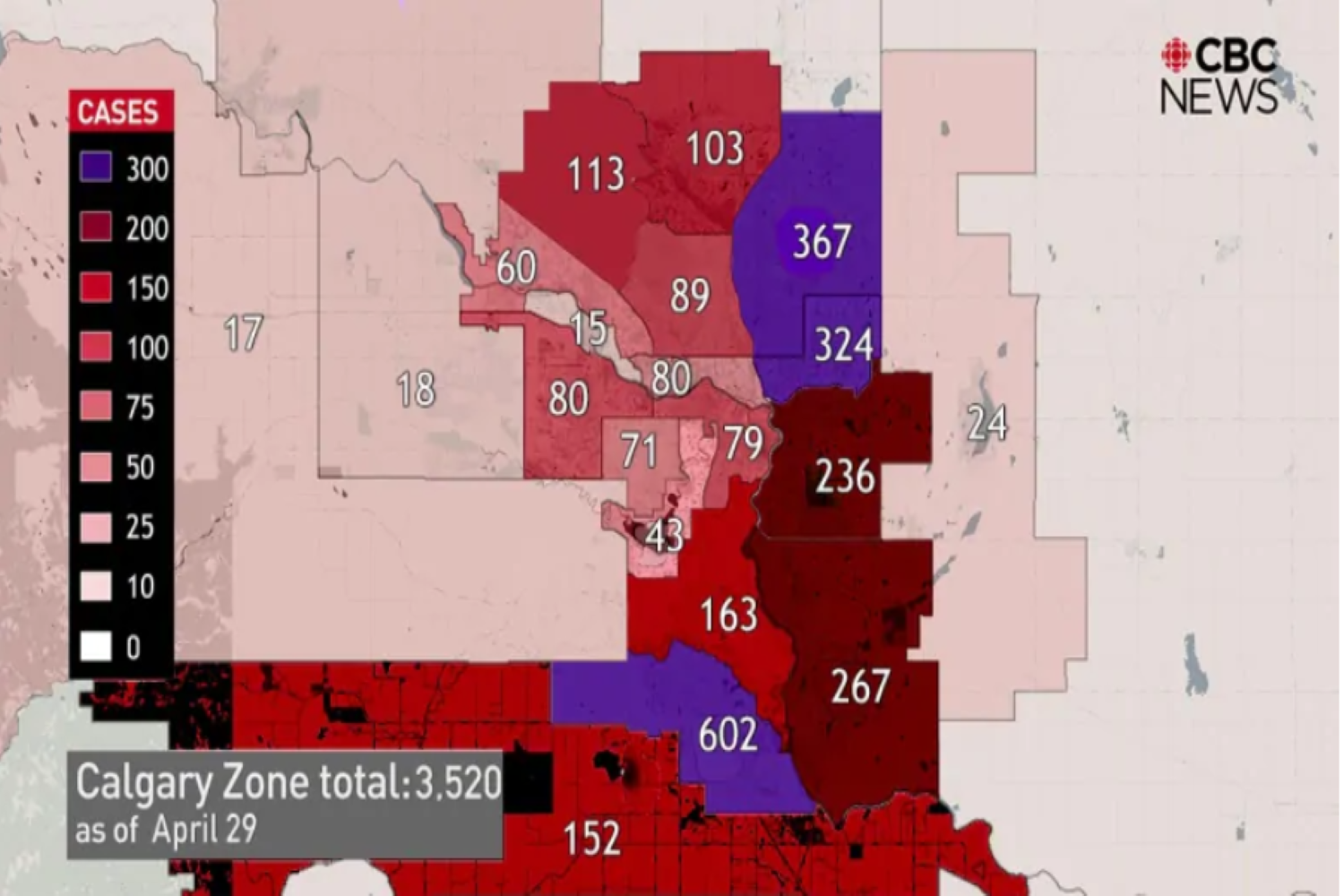
According to the map, the deeper south and the northeast of Calgary have been hit hardest, followed by southeast communities and (to the surprise of no one) more central, inner-city areas.
The publication also included a link to the Alberta Government’s updated coverage, which has a ton of tables and charts separated into demographics. It also gives us an insight on hospitalization rates, testing, and case status.
For the original article on COVID cases, you can check out the CBC here and for the Alberta gov’s website, you can click the link here!
It’s mighty eye-opening, folks.