This site shows Canada’s COVID-19 curve compared to other countries


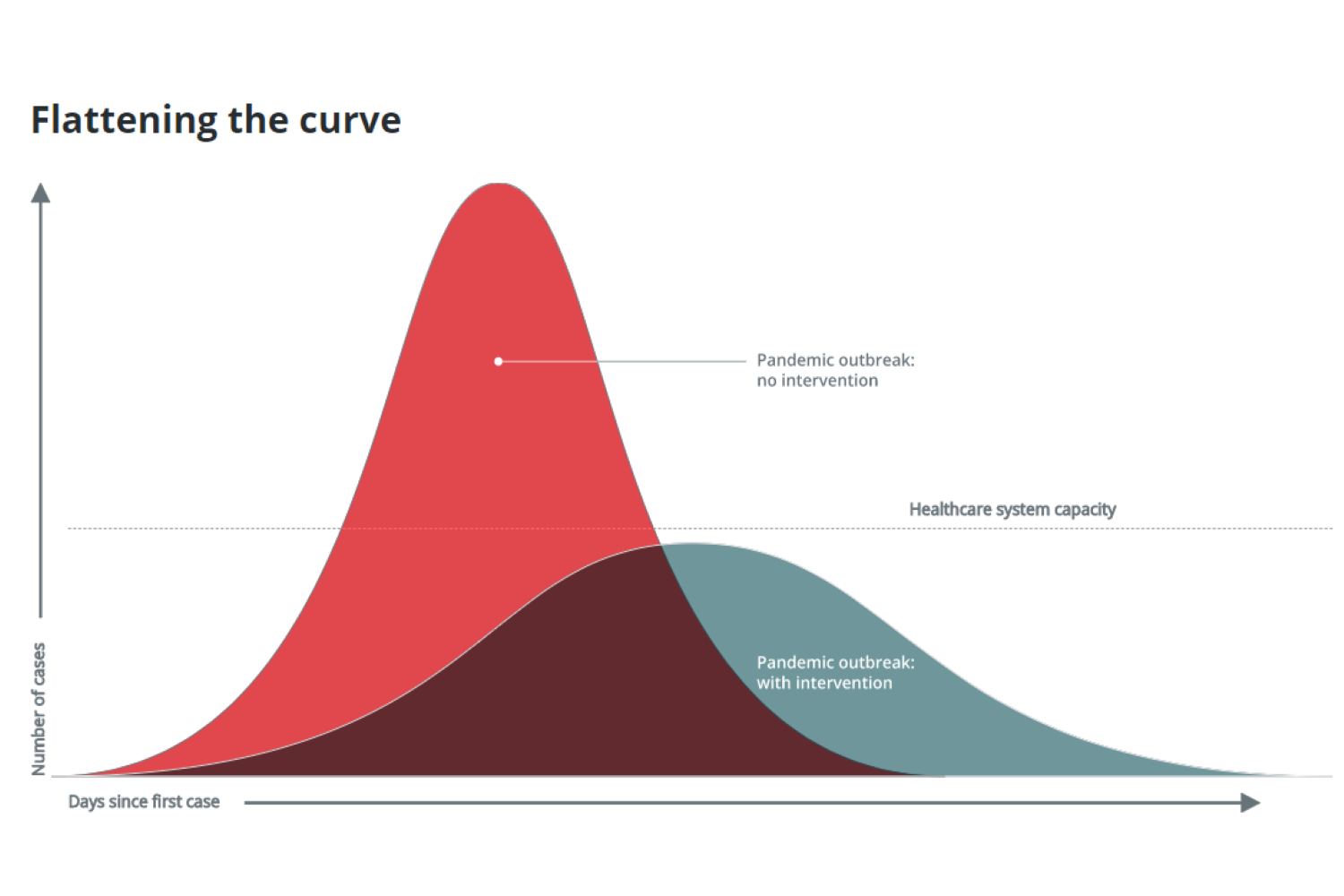
Like us, many of you probably appreciate a good ol’ visual aid. We hear COVID statistics every day and are told to flatten Canada’s curve, but what exactly does that mean? How close are we to doing that and how well are we doing in comparison to other countries? Well, in an attempt to answer those questions, CBC has developed a “real-time” table, and we thought it was important to share it with you guys.
The graph shows 10 of the world’s countries hit hardest by the Coronavirus, how well and also how quickly each has responded to the outbreak.
Related posts:
This Calgary business is making (modified) wedding dreams come true
Nordstrom just launched its official Canadian site with free shipping!
Though we didn’t immediately restrict travel like South Korea, Canada has managed to maintain the spread better than most. On day 26 of the outbreak, we have just over 15,000 cofirmed cases where as the US had 101,657.
Of course, it is important to take into consideration things like population, demographic and geography. That’s most likely why we see Singapore, with a population of 5.8 million people, much, much lower on the graph than Spain, who as of this year, has a population of 46 million.
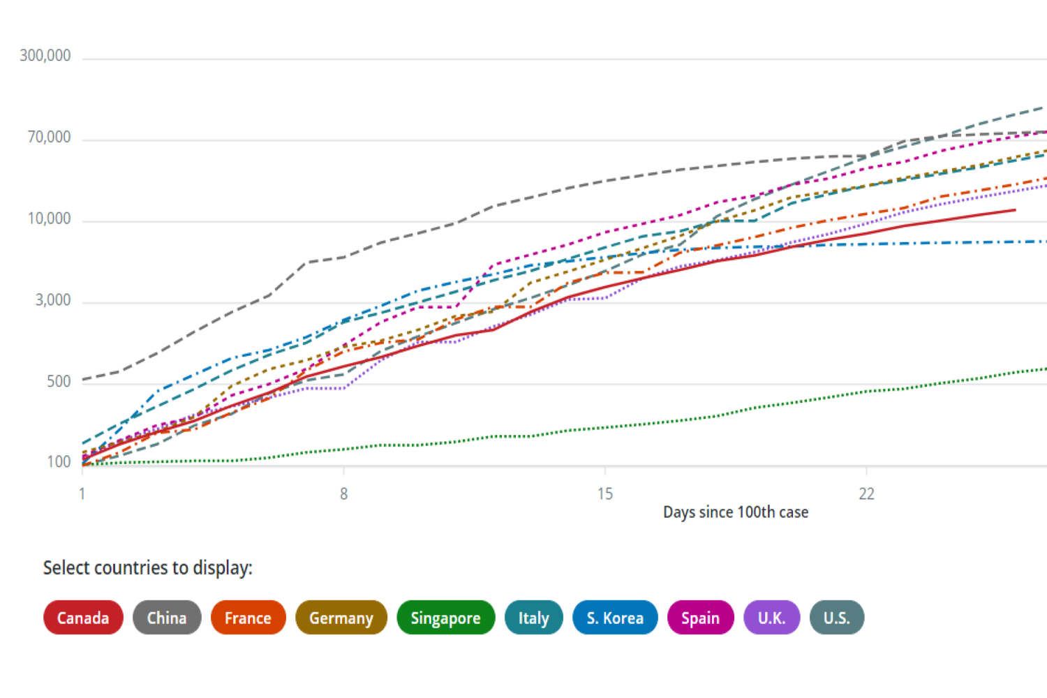 All in all, with a population of 37.7 million people in Canada and a median age of 40, we think we’re doing an incredible job, and that’s mostly thanks to our health care system and officials who were so quick on the draw.
If you’d like to check out the original table on Canada’s COVID statistics, which is updated daily, you can do so here.
We’ll get through this, folks! As long as we keep doing what we’re doing, this will be over before you know it.